Form Editor - Where Users Build & Connect Forms
The Form Editor in Intellectible allows you to build user-facing interfaces that interact seamlessly with workflows. Forms act as essential input sources where users provide data and as dynamic displays where workflow-generated results are presented. Mastering form creation, event handling, and workflow connections will help you build powerful, interactive automation solutions.
Interface Elements
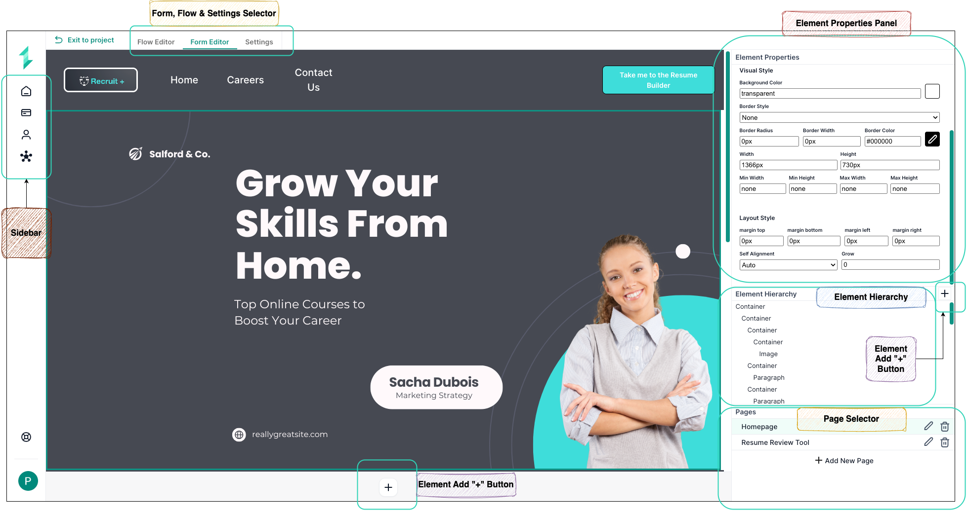
Upon accessing the Form Editor, you'll interact with several primary interface components:
- Sidebar: Navigate back to the home screen and quickly access Intellectible's Home Dashboard, Flow Editor, Form Editor, and Settings.
- Form, Flow & Settings Selector: Quickly toggle between Flow Editor, Form Editor, and Workflow Settings to streamline your design and configuration process.
- Element Properties Panel: Adjust individual element properties such as labels, input validation, event handling, and visual styling.
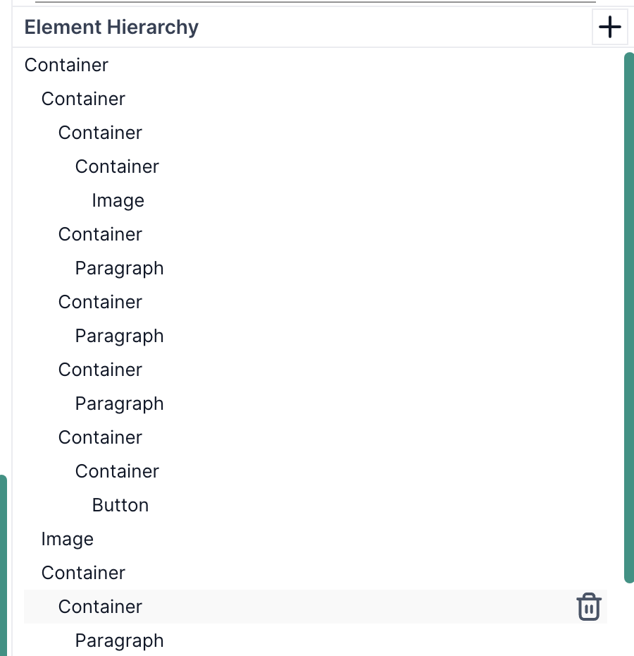
- Element Hierarchy Panel: Visualizes the nested structure of elements on your form, facilitating organization and rearrangement.
- Pages Panel: Facilitates managing multiple pages within a single form, ideal for complex data collection and presentation.
- Element Add "+" Button: Allows the addition of new form elements onto the canvas swiftly.
- Form Canvas: Provides a visual workspace for designing, arranging, and previewing form elements.
Creating a New Form
- Navigate to the Form Editor in the top menu.
- Click "Create New Page" to start a blank form.
- Name your form clearly (e.g., “User Input Form”).
- Add elements to the form using the Element Add (+) button.
Common Form Elements & Components
The following is a complete list of available elements that can be added to forms using the Element Add (+) button. These elements allow for flexible layouts, interactive experiences, and both input and output handling. Use this reference to understand which element best suits your data collection or display needs.
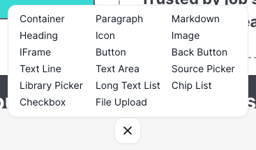
Layout & Display Elements
| Element | Description |
|---|---|
| Container | Groups other elements together and controls their alignment and spacing. |
| Heading | Adds a large heading to help users understand section titles. |
| Paragraph | Displays multi-line instructional or informational text. |
| Markdown | Enables you to add styled content using markdown syntax. |
| IFrame | Embeds another webpage or view into your form. |
| Icon | Adds visual icons (e.g. to indicate a step is completed or information). |
| Image | Displays static image content such as a logo or reference graphic. |
Input Field Elements
| Element | Description |
|---|---|
| Text Line | Basic short single-line input. |
| Text Area | Large, scrollable text input field for longer responses. |
| Long Text List | Dropdown selector with a large data list (good for names, categories). |
| Chip List | Select multiple items from a list – each shown as a “chip”. |
| Library Picker | Allows selection of a document from the user’s document library. |
| Source Picker | References linked or external sources like APIs or datasets. |
| Checkbox | Simple toggle switch (yes/no or true/false). |
| File Upload | Uploads files like PDFs or images into the form. |
Buttons & Navigation Elements
| Element | Description |
|---|---|
| Button | General-purpose button to trigger actions (e.g. submit, run AI). |
| Back Button | Navigates to the previous form page. Useful in multipage flows. |
Connecting Forms to Workflows
Connecting forms to workflows is what brings your forms to life. This connection allows user inputs to flow into automations and lets workflow outputs return directly to the form. Whether you're collecting a user's message, generating an AI response, or updating a document, this two-way link is essential to building dynamic, responsive user experiences.
To create these connections, you’ll rely on a few key practices:
1. Name Your Elements Clearly
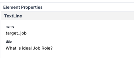
Each element in your form (e.g., Text Area, Dropdown, Button) must have a unique name. This name is what workflows use to identify and interact with the element.
Example: A text input where a user enters their Ideal Job Role might be called
target_job.
You can assign a name to an element by selecting it and editing the "Element Name" field in the Element Properties Panel.
2. Use the Names in the Flow Editor
When building your workflow, you can use Load Form Data and Set Form Data nodes to interact with form fields by name:
- Use Load Form Data to retrieve user-entered values from the form.
- Use Set Form Data to push processed values back into the form.
These nodes work by targeting the unique names assigned to each form element in the Element Properties Panel.
3. Trigger Workflows from Buttons
To trigger a workflow when a user clicks a button on a form, you’ll need to define a Form Event. This is done in two steps:
-
Name the Button
-
Select the button in the Form Editor.
-
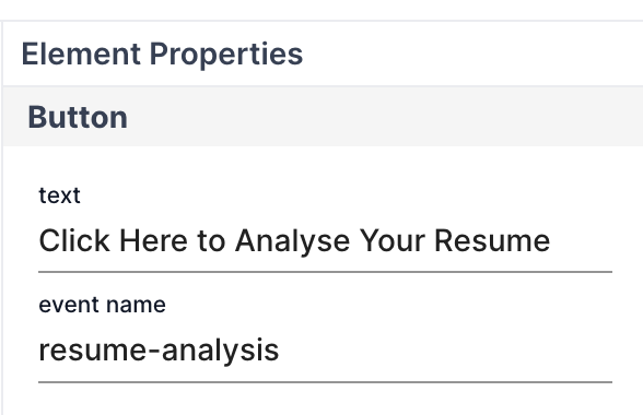
In the Element Properties Panel, set the
event namefield. -
This name is what the workflow listens for.
Example: A button with the text “Click Here to Analyse Your Resume” might have an event name of
resume-analysis. -
-
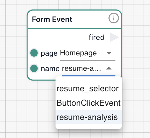
Use a Form Event Node in the Workflow
- In the Flow Editor, drag in a Form Event node.
- Set the page (e.g.,
Homepage) and name to match the button’s event name (resume-analysis). - The node will fire whenever that button is clicked.
This allows your workflow to start dynamically based on user interactions.
Example: Clicking the “Analyse Resume” button triggers the workflow listening to the
resume-analysisevent on theHomepagepage.
Testing & Iterating Forms
- Click "Run" in the Form Editor for a live preview.
- Input test data to validate form functionality.
- Verify workflow responses and adjust form layout and element settings as needed.
- Ensure buttons correctly trigger workflows and display outputs properly.
General Element Properties
The Element Properties Panel provides consistent styling and layout options applicable across most form elements. Customize visual appearance and structural behavior to enhance user experience.
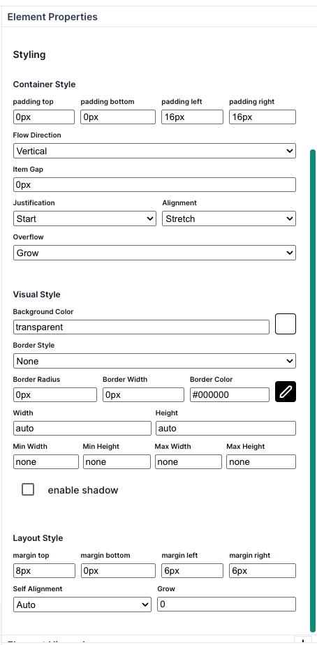
| Styling Category | Setting | Description |
|---|---|---|
| Container Style | Padding | Defines spacing inside an element. |
| Flow Direction | Organizes nested elements vertically or horizontally. | |
| Item Gap | Spacing between nested elements. | |
| Justification | Aligns nested elements horizontally. | |
| Alignment | Aligns nested elements vertically. | |
| Overflow | Manages content overflow within elements. | |
| Visual Style | Background Color | Sets element background color. |
| Border Style | Defines the border appearance. | |
| Border Radius | Rounds border corners. | |
| Border Width | Thickness of borders. | |
| Border Color | Border color specification. | |
| Width/Height | Sets dimensions. | |
| Min/Max Width & Height | Constrains dimensions within set limits. | |
| Enable Shadow | Adds shadow effect for depth. | |
| Layout Style | Margin | Controls spacing around elements. |
| Self Alignment | Positions elements within containers. | |
| Grow | Controls element expansion in available space. |
Specific Element Properties
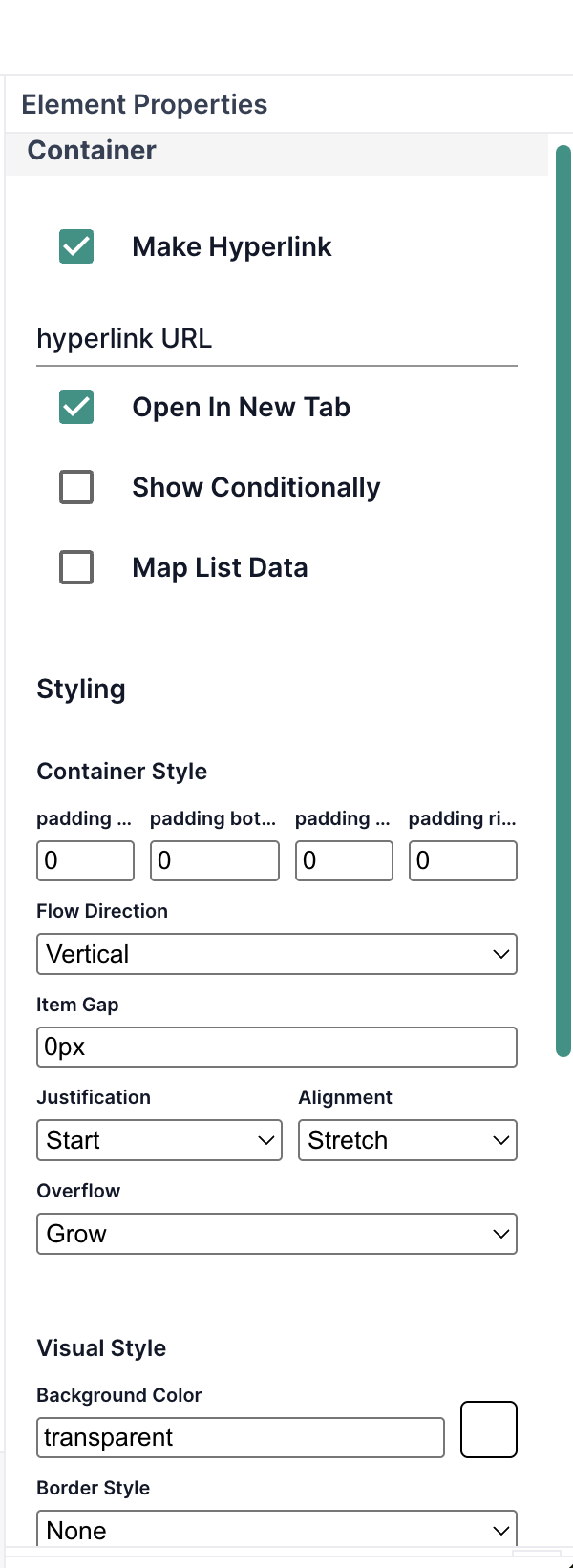
Individual elements may include additional specific settings. For example here is the Container element settings below:
- Hyperlink Settings: Convert elements into links, define URLs, and link behavior.
- Conditional Logic: Dynamically show or hide elements based on criteria.
- Map List Data: Populate elements dynamically from workflow data.
Element Hierarchy Panel
The Element Hierarchy Panel gives you a structured, tree-like view of all elements on your form, including how they're nested inside containers. This view is essential for:
- Quickly locating and selecting deeply nested elements.
- Understanding the structure and flow of your layout.
- Reordering elements by dragging them within or across containers.
- Cleaning up unused or duplicate elements.
This panel mirrors the structure on the canvas, making it easier to work on complex forms where elements may overlap or be hidden inside collapsible sections.
Use the hierarchy to keep your layout clean and consistent—especially when using nested containers.
Pages Panel
The Pages Panel helps you manage multi-page forms. Each page acts like a separate screen or section within your form.
From this panel, you can:
- Add new pages using the “+ Add New Page” button.
- Rename, reorder, or delete pages for better flow and clarity.
- Switch between pages to edit different parts of your form.

Deploying and Embedding Forms (Implementations)
An Implementation is a live, shareable version of a form in Intellectible. It acts like a public-facing tool or mini-application, allowing external users or collaborators to interact with a workflow without needing access to the Intellectible editor or dashboard.
Implementations are ideal when you want to:
- Collect data or files from users outside your team
- Let people interact with a form-driven workflow without granting editor access
- Share a tool or service publicly while protecting the workflow logic
- Deploy workflows safely, with version control and optional access restrictions
For more information
Best Practices for Form Design
- Ensure intuitive and clearly labeled form layouts.
- Apply conditional logic thoughtfully.
- Conduct thorough testing with realistic scenarios.
- Regularly update forms based on feedback and evolving workflow requirements.
By fully utilizing the Form Editor's features, you can build sophisticated, interactive forms that seamlessly enhance your workflows and user experiences within Intellectible.